Sunday, 27 March 2011

Next week: new pages!


Part II: Sunrise

Chapter 1: Brothers and Sisters

Blood runs thicker than you would think.

1-3 - 4-6 - 7-9 - 10-12 - 13-15 - 16-18 - 19-21 - 22-24 - 25-27

The story continues on Sunday, 3 April!

I hope it's not too confusing - I'll be picking up the thread of the story that I posted before The Darkest Hour. It is only while I was scripting that story that I realised I would have to tell Ygraine's story first, so I went back in time and gave you the backstory of Gawain's grandmother, mother and Auntie Morgana. Now that is done, I can pick up again where I left off. In case you need to refresh your memory, you can find the links to previous pages above :).

(Incidentally, pages 25-27 need editing, because Morgana isn't being entirely honest about her purpose there. At the time I thought that was a good thing, for some reason, but in the meantime I have changed my mind. That's what I get for posting a draft comic... Sorry about that.)

Tuesday, 22 March 2011

Cover design sketch

I had an idea for a possible cover, so I thought I might as well sketch it. I like the result, but I have reservations about the degree to which it represents my story :P. The image shows an essential aspect of Gawain, but I'm worried that it might give people a wrong idea of what kind of story will follow. And I don't know about you, but personally I hate deceptive covers...

Oh yes: I am quite aware of the fact that it is a little ludicrous to be fussing about a cover when there aren't any finished pages yet. But seeing as deciding on a cover image turns out to be quite hard, I think it doesn't hurt to give it some thought before matters really become urgent. *g*

Also, I am clearly not a designer -_-.

Sunday, 20 March 2011

Sketchdump! (2 of 2)

Medium: Damiaanactie pens :-). No preliminary pencils, no means to correct anything. For some reason, that is liberating and fun.

In this second batch of sketches, it's all Gawain, all the time!


Sketchdump! (1 of 2)

...I try to sketch other things than faces (because I need to practice drawing other things than faces - very badly), but as you can see, I can't always get myself to do it ;-).

All Gawain.
Ygraine, Morgana, Cai, Gwenhwyfar.
Gawain, Owain, Agravain, Nimue (2 versions, both unsatisfactory), Morgana, Morgause.
Morgause, Gawain and Morholt.

Tuesday, 8 March 2011

Between Worlds

It's been a while... I have been sketching a lot and working on the continuation of the comic, but I haven't produced much that is postable. Unless you like to see my scribbles. It does mean that I'll start posting layouts again soon, so there will be some more reading material for you :).

The picture above is my first ever A4-sized colour pencil illustration. Actually it started off as a sketch on a stray sheet of Bristol board, but when I'd done the face I liked it so much that I thought I had better turn it into a complete illustration. Because it wasn't at all planned, I improvised all the way. The main reason why this turned into a mysterious night scene is the falling star on the left. It wasn't a falling star. It was a few random lines to try out the feeling of my colour pencils on the sheet of paper. And I found I couldn't erase it. So I had to incorporate it into the picture somehow. Disenchanting, eh? XD

I really enjoyed working with colour pencils here, and Bristol board is the perfect carrier, as far as I am concerned - though I'll go for a heavier sheet in the future. However, I was also reminded why my original idea of doing the comic in this medium ultimately had to be discarded. It's so terribly time-consuming. I probably spent about ten hours on this, everything taken together. But it looks pretty :-).

I'm thinking now that I did something stupid buying Classicolor pencils. I love my Caran d'Ache and the colours are great - but they are water-soluble. At the time, I thought that was an advantage, but now I'm not so sure anymore. I probably should have bought Pablos rather than Classicolors...

As for Morgana, I'm thinking this more or less settles her look. You have seen her in purplish/grey and black habits, but I have settled for white. I like the idea of Morgana and her nuns as ghostly (white) Wise Women ("witte wieven", "weisse Frauen", "Dames Blanches"). These legendary beings have the same combined association with mischief and wisdom that I'm looking to give to Morgana. In the picture, she's also wearing the Celtic cross I found for her - not your classic Irish cross, but a continental one, because the Irish crosses that we know so well are really too recent (8th century+).

Finally, I had been thinking about how Morgana does her magic. Magic in my story is mostly organic - Morgana, Morgause and Ygraine make things happen just by being somewhere. Ygraine walks across a field and stuff starts to grow. Morgause ditto, and when she touches a wound, it heals. Morgana can kill with a touch. But she's powerful enough to do magic from a distance, as well. I don't want her to use spells, though, but a special gesture would be nice. Now, I was reading Tsubasa Reservoir Chronicle, in which wizards use the index and middle fingers of their right hands as a kind of conduit for their magical power. This gesture looks like a religious blessing in the West. Well, if that isn't perfect for my Morgana, I don't know what is :-). So here we are. Lots of stuff settled in one picture *g*.

Saturday, 12 February 2011

Bad photos of first pencils

The most annoying thing about working with a large format (A3) is that I can't scan my pages at home. The scanner is A4. So you get some bad photos instead. Sorry about that. The light has been bad for the past few days, so that didn't help the quality either. In any case, here is proof of the fact that I'm working on the 11-page episode "The Sword of Kings" to find out whether my new style works - and can be sustained for lots and lots of pages.

Not being able to do my own scanning is very annoying, but on the other hand, I can't remember how I ever managed to draw comics in A4. I have become fully reconciled with A3 - and in fact I sometimes wish my originals could be even larger XD.


(click for full view)
Slightly re-designed Uther, more British and more fifth-century than before :).
The 'Sword of Kings' was based on the sword of the so-called Lord of Oss. That means it is at least 1,000 years old when it comes into Uther's possession. (The original was 200 years old when it was buried with the Lord of Oss, so why not?)

(click for full view)
Look, it's the Giant Herdsman! I love to draw him. The perspective and the beasties were a challenge, though.

Next stage: transfer le tout to watercolour paper, then ink, then paint. Finally: add speech bubbles and text in Illustrator. Clearly, we're not done yet. I'm going to do all the pencils first, though. I like the idea of letting the pencilled pages lie around for a while, to leave room for possible corrections. I rarely spot my mistakes at first sight, so a little distance can't be bad.

Monday, 7 February 2011

YES!!

We're getting there! As usual, things take time to fall into place, but I have reached the point where I know I am on the right track :).

Two things: I have sorted out my hero's character design, and I have sorted out the style I want for my story. The picture below demonstrates both. Okay, it also demonstrates my trademark wonky perspective, but guess what: I'm fine with it.

So here is young Gawain, sporting a very Irish costume consisting of leine (tunic), ionar (vest) with belt, and brog (shoes). He has a round Irish shield with his traditional five-pointed star emblem and a long sword with a simple design. The ionar counts as protective gear - it is made of leather and quite strong, but much lighter than chainmail.

The picture was painted on hot-pressed Arches paper. I like this paper because it's so very smooth, but at the same time it is more difficult to work with than rougher paper types. especially for washes. So although I'm happy with how this turned out, I will probably be using cold-pressed paper for the comic because it's just a little bit less tricky.

I guess I will be inking after all. This was inked with dark brown Faber-Castell PITT pens - one Small, one Brush - and I like these so much that I can just envision doing the whole comic with them. Despite the fact that they run out of ink disgustingly soon and are not cheap at all around here (as opposed to in the States! which is so unfair!). But I'm very happy with the lines they get me. This combination of clean line art and watercolour turns out to be the thing I have been looking for all this time. Even if it's time-consuming, I'm going to have to go with it. This is my pet project; I haven't got a publishing deal or deadlines, so I'm thinking I'm free to make the comic I want :)...
Heh. You know, this picture really makes me feel good!

Sunday, 2 January 2011

Florie

Sometimes I think that watercolours and I can be great friends. Like now. I'm beginning to know what I am doing with these paints, and I am surprised at the amount of control I turned out to have this time round. I think I'm also getting better at distinguishing between the colours things have and the colours they need to have in order to look good. So this painting of Florie has been great fun for me and I'm happy with the result. The lesson to learn (as if I didn't know it already) is that I should just paint as often as possible. All in all, I have painted 11 pictures this week, and I notice the effects. The happy result is that I am getting less scared of doing the comic in watercolour. I'm not looking for "great art" - just something that looks adequate and pretty and less likeliness for me to ruin a page of line art. 

So let's see what I can do in the new year :).

Sunday, 12 December 2010

Inks and paints...

Cecilia is on a campaign to try and make me change my plan of not inking the comic and painting the pencils instead. She is quite insistent on the matter. What to do? An "artist" (I don't like applying this term to myself, but I haven't so far discovered an adequate English translation for "tekenaar", which I do feel I can call myself, despite not being a professional) like me, whose skills are rather limited, has to make the most of the things s/he is good at. So what am I good at? The first thing that springs to mind is "lines" and "inking". It's certainly not colour. Then why on earth would I cut out the inking? Well, for one thing, it takes ages - I ink very, very slowly. For another, I feel like my pencil originals are more lively than my inked versions. I tried to remedy that by using brush pens instead of my faithful Staedtler pens. But with brush pens, you can't draw the tiny details and microscopically smooth lines that I am so anal about. (Yes, I know, why fuss about that when there are still basics that I don't get right? Well, that's me for you.) So inking with brush pens would mean a) adapting my style and b) overcoming my fears. A third reason why I am inclined to dispense with inks is because I feel that stark black lines don't suit my story. I want something softer and more dreamy.


Now - I have recently done a picture for my sister, inked with two Faber-Castell PITT pens, one brush and one Small. It reminded me how much fun these pens are (even if they tend to lose their shape pretty quickly :/). It also reminded me that these exist in a wide variety of colours, so that I wouldn't have to use black. So this week I popped into one of the two art shops in my street and bought a handful of PITT pens in a variety of colours - Caput Mortuum, Warm Grey, Indian Red and Raw Umber. At first, I was a tad nervous about the fact that these colours only exist in brush pens, meaning that I haven't got a Small pen for details or corrections... But then I thought, what the heck, I'll just have to learn and adapt my inking to the brush like a big girl. Above is my first all-brush inked image, done with the Raw Umber pen.

The lady in the picture, as you can tell by the caption, is Florie. She is Gawain's second wife and the daughter of the Carl of Carlisle. The text of Sir Gawain and the Carl of Carlisle doesn't give her a name, so in a previous incarnation of the character I picked a random  Welsh one for her. In the meantime I have changed her name to Florie, which is a name traditionally associated with Gawain. It fits nicely, too, because the sons Gawain has with his second wife are called Florens and Lovell. Okay, Lovell is not so relevant here, but Florens can easily be the son of Florie, right? :-)

Anyway - this image is waiting to be coloured. I hope to get round to it soon.


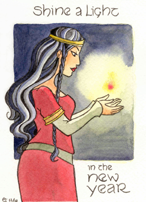
This little portrait (postcard size) was drawn two weeks ago as an experiment. I wanted to try a combination of colour pencils (for the line art) and watercolour. So this was drawn with a purple pencil and then painted. It didn't work at all. The lines were too pale or not sufficiently defined or something - in any case, the image looked lousy. This may be partly because I used opaque paints - it's possible that the lines would have looked better if I had stuck to transparent ones. I started with a wash of Ceruleum Blue and some orange (made of Winsor Yellow and Permanent Carmine). That mixture produces a lovely, delicate tint (I think), but even though it's pale, it's not transparent. So it was probably not a good idea to use it for washing. In an attempt to save what I could of the image, I accentuated the lines with my Caput Portuum PITT pen, which turned it into something more or less acceptable. 

So what did I learn? Well, first off, I guess I shouldn't be using opaque paint in washes. And secondly, it might be a good idea to draw hair like Lot's in such a way that I can colour it in a more straightforward manner in the comic. I have to simplify it. 

...And a textured version, because the watercolour didn't live up to my hopes ;P.