Tuesday, 8 July 2008

Doodles from work...

I gathered a few doodles from one of my notebooks at work. Whenever I am distracted for a moment, I draw a doodle :-). Three characters were actually born in the office! *g* Andecamulos was the first. Vitios the blacksmith was the second - you haven't seen him yet. The bard Cantorix is the third:


(my first few Cantorix sketches)

(crouching people without reference = AARGH)

(first sketch of Comm without a beard.
doesn't look a lot like Comm at all, does it?)

Friday, 27 June 2008

Double Comm

I was thinking the other day that a nice, and very clear, way for Comm to show his allegiance to Rome would be to adopt the clean-shaven, short-haired Roman style. Such a gesture overcomes language barriers. It's a little painful for me, because I love Comm's long hair, and to have to sacrifice it... But it makes so much sense to me that I have decided to put aside my personal preference :-).

Now, the tricky part is of course to make him still look like Comm, even when the beard has gone. For me that is not an easy matter. One reason why I gave him a beard is, of course, to make it easy to distinguish him from other characters. So far I have only one dark-haired man with a beard, and that is him. When I remove the beard, he looks awfully much like a generic Roman :/. Of course that is the point, but it doesn't make things easier for a reader. For me personally it is quite obvious that this is Comm on account of the shape of his nose, but that is probably not enough, because his nose doesn't have any particularly striking features. It's shorter and rounder and more turned-up than other characters', but I'm not sure that is obvious to anyone but me. I'll have to think of other ways to distinguish him - like giving him a torque. That would make sense :-).


Apart from experiments with Comm's look, these two pictures are also the first two that I have inked with brushes. I'm not sure how I feel about the results. I like what brushes do to the inked look of Comm's hair. But I was not quite at ease with the lack of control I had over the brush, and the lines did not come out as I had hoped. No doubt I shouldn't expect a lot when I do something for the first time, and I do think that inking with brushes requires serious skill - something I can't have unless I exercise a lot. Nevertheless, it annoys me that my brushwork lacks crispness, and that the broad strokes were still obtained by going over a line several times, which is the same thing I do with my Staedtler pens. I wanted to see if brushes could give me a more flexible stroke, and in that respect I was a bit disappointed. Then again, it may be the lack of exercise. Which only means I should try plenty more :-).

Sunday, 22 June 2008

Volca & Veridicus

I tried out my watercolours on ordinary drawing paper. The result is better than I thought... It may depend on the paper brand, though. This is Daler-Rowney; so far I have painted on Canson and that never looked good - I got the feeling the Canson paper absorbed the paint so quickly that I couldn't push it around, so to speak.

Anyway, here is Volca, looking, I think, rather prettier than I supposed her to be - but maybe that is because she is holding a dagger. She just feels a lot better when armed. She does not normally appear this confident :-).

Her story is developing. I'm liking her better and better *g*.

I'm getting more confident with my watercolours, and I do feel like I'm learning to understand the colours better. When I mix paint, I get closer to the tint I had in mind than I did before :-). Now I just need to exercise more until I know how to control this medium better and get the effects that I want...

Oh, btw: please click the painting for the large view. I think it's better :D.


Look, Veridicus has a face! Well, I had sort of given him one before, but it didn't quite feel right yet. Now he has a particular nose and a particular mouth and very lovely curls and I know it's him. I happen to think he's rather cute, but you aren't obliged to share my opinion :-).

This was drawn on 160 g/m² Daler-Rowney paper. I was intending to paint it, just to see how the paper would hold, but in the end I spent so much time pencilling the hair that I didn't want to risk obscuring the pencils on the curls with paint. I also fixated the pencils, and I wasn't sure what would happen if I tried to paint over that.

I have been wondering about Veridicus' rank in the Roman army. I am reading a biography of Caesar by a Major General Fuller, but I have trouble grasping the mechanics of Roman politics and the cursus honorum. It seems a very complicated system; I will have to read more about Roman society in order to get a grasp on my Roman characters. At first I thought of Veridicus as an eques, but he can't be an eques if his father was a consul :/. I had quite forgotten that the equites weren't nobles; and I didn't realise that only nobles could become consuls. He can't be a Tullius Decula and not be a noble. Now, seeing as he is of senatorial rank, he will automatically be among the high-ranking officers in the army. He can't be a tribune, because he is too old to be a laticlavius, and the angusticlavii were equites. On the other hand, he is too young to be an evocartus or a praefectus. As for a quaestor, I'm quite sure that Caesar had only one with him, and that we know who it was - definitely not my original character ;-). That leaves the legatus. To be a legatus would make him a general. That's rather higher-up than I intended him to be... Maybe I'll come across another possibility on further reading. I'll keep my eyes open.

Sunday, 1 June 2008

Caesar!

I saw this news item last week, entirely by accident, but I have been so busy at work that I forgot all about it until I found it linked at Colleen Doran's blog:

A bust of Caesar was found in the RhĂ´ne! Here's the article plus photo in the Daily Telegraph. Apparently it's the oldest depiction of Caesar to date...

Cecilia, if you read this: never again say that I draw his cranium too large! ;)

Saturday, 10 May 2008

Watercolour in Gaul

Last weekend I had great fun messing around with my watercolours. I have rather come to adore them, even if the results don't always live up to my enthusiasm :P. It suddenly occurred to me that I have bought two Moleskine watercolour notebooks, but that I have been nervous about using them. It's always like that with me: I am addicted to notebooks, but somehow I have the idiotic notion that I shouldn't use them unless I am going to produce a masterpiece. But why on earth shouldn't I use them to doodle and experiment? *shakes head at self* At least it would mean I have my pictures (good and bad ones alike) together in bundles instead of on loose bits of paper that lie around or get lost and/or damaged. So I gathered my courage and started painting furiously. The six little pictures/portraits that resulted are of various quality and can be found below.

My War in Gaul story is developing very slowly. I have a large cast, I think, but recently I realised that in fact it is still too small. That is, there are many more characters surrounding my main ones who need to have a personality and a history (even if those are never made explicit or treated at length) if the story is to work. Also, for one thing, canon (hee hee, I find a silly glee in applying that term to Caesar's writings) has it that Ambiorix flees with four of his warriors - those people have to be real, because he's going to be spending a considerable amount of time with them. So far I have only got one with a personality; a second one has a name and an occupation. The other two - no idea yet. But they'll come along.

I am also happy to say that as of a few days ago, dear Comm has three wives. Their names are Verctissa, Momora and Cunovinda. As of today, Verctissa has a story. I love her :-). Expect a portrait soon...

The paintings. As you may remember (but probably don't), I had given Ambiorix four sisters - two are older than he, and two are younger. They are gradually acquiring distinct personalities, and I amused myself last Sunday by painting little portraits. The thing is that the four women and their brother all look very much alike, but that they should be readily distinguishable from each other nevertheless. I have so far experienced a bit of difficulty with that :/. I am rather happy with how they turned out in the pictures, even though some of the pictures aren't particularly good as pictures.


Photobucket


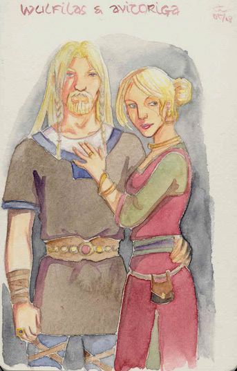
I painted this one last, but I am putting it first because Avitoriga is the eldest of the siblings. She is probably closest to her brother in terms of character; he learned a lot of his cunning ways from her.

Avitoriga is married to Wulfilas, a Germanic noble. Originally I thought of him as king of the Chatti, but I have decided it would be more fun if he were a Cheruscan king. After all, he is supposed to take Ambiorix & friends in when Caesar has destroyed their land for the second time. The Cherusci receive a short mention in De Bello Gallico. In 9 AD, the Romans will suffer a crushing defeat at the hands of the Cheruscan prince Irmin/Arminius in the Teutoburgerwald. It's just too tempting to forge a connection between Ambiorix and Irmin, though I'm not sure yet how it is all going to work. I may at one point have to change Wulfilas' name into Segimerus (or Sigmar; Sigmar sounds extremely German, but if you ask me, Segimerus could as easily be made to sound more Celtic - as far as I am concerned it is pretty close to a name like Segomaros...)*. Another fun detail is that the Cherusci are thought to have been at least partly Celtic, so it all seems to fit marvellously well.

Drawback: Enrico Marini is currently making a comic about Arminius, Les Aigles de Rome. The linkie takes you to a site that offers a few page previews, demonstrating some of Marini's brilliance. One does not, as a pitiful amateur, wish one's readers to think of Marini's gorgeous watercolours when perusing one's own feeble attempts at the art of the comic ^_^; ...

*The mix-up between Celts and Germanic peoples is fascinating. Look at the name of king Marbod of the Marcomanni. The Marcomanni are supposed to be a Germanic tribe. But Marbod is apparently a kind of mangled form of Maroboduus. Now, "boduos" means "raven" in Celtic and is found in Celtic names like Catuboduos, Boduogena, Boduognatos and Boduocos. Maro - well, plenty of maros and maras in Celtic names too: Britomaros, Segomaros, Coviomaros, Dannumara. And then the name of the nobleman he exiled: Catualda. Catualda! "Catu" is Celtic for "battle", as in Catuvolcos, Catumandos, ... Catual, Cadafael Cadomedd, Cadwaladr ap Cadwallon, anyone? It doesn't get more Celtic than that :D! Though I must admit the "-lda" part sounds pretty Germanic. I dunno. It seems to me we are just a little too keen to divide these people into different ethnies when they were actually rather alike.

But I digress :P. Back to the matter at hand. I like the colours of this picture, especially the green and burgundy. They are the kind of tints I have long been wanting to mix, but I had no idea how, and finally stumbled upon them by accident.


Allicia & Visurix


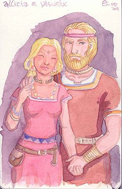
This lady who is far too pink/reddish in the face is Ambiorix's second sister, Allicia. Her husband (not looking too good here, sorry) is Visurix (a cool mix of Germanic and Celtic too, that name: Germanic "wise" and Celtic "king", and I didn't make it up), whom I have made king of the Menapians. He lives on the hill of Blandinion, which happens to be the Hill I am currently Under :P. Canon says that the Menapians were Ambiorix's allies; that is why Caesar came to hunt them down in their marshes and handed the command of the tribe over to Commios.

Visurix is a lucky man. Allicia is the sweetest of women.


Abesa


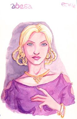
Abesa is Ambiorix's younger sister, and the drop-dead-gorgeous one. She's a bit of a pain, though, which I trust will lead to some sparks in the plot and the dialogue ;). I have thought of a few nice twists for her, but I can't reveal them yet.


Albiriga


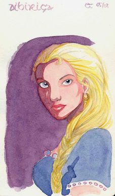
This is Albiriga - Aia for short - the youngest of the siblings. The painting looks better in reality than it does on the scan, but it's still not very good; the dark shadow is basically my clumsy attempt at hiding the fact that I did the skin tones as badly as I did them for Allicia :/.

Aia is a bright and cheerful girl and possibly Ambiorix's favourite. He likes to think he has to protect her, but actually she protects him :). She deserved a better portrait.

Finally, there are the first two pictures I painted - last Saturday that was. This is a character I invented only last week: Andecamulos, Ambiorix's best friend. (He really needed one.)

Andecamulos

Photobucket


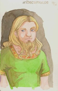
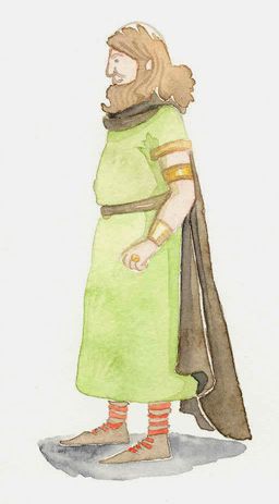
If I said that he's my Obelix, I would probably be giving the wrong impression. I just find Asterix rather inescapable when cooking up my own Gaulish universe, even if the comical and parodical tone of that series is completely inappropriate to my story. But it seems obvious that whenever a bard is mentioned, lots of people will think of Assurancetourix/Cacofonix, and when you read about druids anywhere, a spontaneous association with Panoramix/Getafix comes up. That happens to me all the time, in any case. I'm not entirely sure why, when I thought of Ambiorix's best friend, I immediately conjured up someone heavy-set, physically strong, and obsessed with good food. It just happened. Then it struck me that sounded rather like Obelix. So to differentiate clearly (*g*), I have made Andecamulos a druid - or at least an aspiring druid, because he is too young to have finished his studies.

Andecamulos is a darling; you'll see. I'm afraid he can't stand Rigantona, but I forgive him :).

BTW, I have been looking for a solution to my problem with the length of all those Celtic names. I think it is probably best to use nicknames for the main characters, and to that end to split those long names into their constituent parts. That means that Ambiorix and Andecamulos can call each other Ambios and Camulos, and Rigantona might address her brother Vercingetorix (try fitting that in a word balloon when you have some dialogue to report too!) with a tender "Cingetos" (whoo! that's only three syllables instead of five!). I'm so relieved that one of my blokes is called simply Comm. I'm not sure what to do about Catutigirnios. I have been calling his father "Catu" in my head, and two Catus would be confusing. Maybe I should switch to Volcos.

Incidentally, in another instance of the Great Celtic Confusion I have read a translation of "volcos" as "wolf" (and it's the premier Celtologist Venceslas Kruta who says so). Previously I have encountered it everywhere as meaning "falcon". Rah. So is Volca now called She-wolf, and her father Battle-wolf? I wonder.

Monday, 14 April 2008

Two watercolours

I have been very busy with - well, work. My job, and especially the commute, is such that in the evenings I don't get round to doing any art. That pleasure is now restricted to the weekends. So I spent most of last weekend playing around with my watercolours. Ever since Cecilia came over during the Easter weekend and gave me a few sorely needed watercolour tips, I have been curious to try them out. Here's a try or two :-).


This picture of Ambiorix (click for a better view) was started when Cecilia was here. She taught me about adding separate washes, in one colour, to all the separate surfaces in the drawing. When she left again, Ambiorix looked like a Martian - I had painted the whole picture in Sap Green. It remained like that for a few weeks, until I had gathered enough courage to test whether I would be able to carry out the tips I had received.

Now, this picture is not exactly a work of art. Cecilia told me to draw something quickly, just to chuck some paint over it and see what kinds of effects could be got. The drawing was no good; even I can see that the arm and hand are too large and the shoulders too narrow, and let's just not mention my expertise at landscape drawing ^_^;... But hey, I don't think that in terms of painting it is quite so bad. Cecilia is probably wincing now, but seeing where I come from... I mean, if things look wonky, it is not the paint that does so, which is a huge improvement for me! It probably looks a lot of other things, things that unfortunately don't include 'brilliant', 'sparkling' and 'amazing', but nevertheless I like to think I have made some progress, no matter how small :-).


This picture I did after the one above. I started it as a commission from a friend, who asked me to design the card that is to announce the birth of her first baby. She did not want any babies, cribs or other classics in sight, and sent me pictures by Dulac and Rackham by way of guides. The paper choice was risky: it is lighter than watercolour paper, and the pale yellow was bound to have an influence on the colours. I did not dare to add layers, and the colours indeed all turned out different from what they would have been on white paper. They all look very pale, the reds and blues turning out pastel. I am not unhappy with it, though. It is difficult for me to pin down my own feelings about the picture because I haven't done - or really felt the urge to do - something like this since I was a teen. I like stronger effects than those of my old books of fairy tales. This is too much sugar - but the fact that it was supposed to announce a baby did not exactly invite sharpness. For too much sugar I am pretty happy with it; but as I said, it is something I have sort of moved beyond mentally.

Friday, 14 March 2008

I'm a hopeless consumer. A months or two ago I bought a box of 12 sketching pencils. I never use sketching pencils! But the box had been brought out as a homage to Arthur Rackham, and I happen to love Arthur Rackham... Ah me. - Anyway, I opened the box last Wednesday and thought I would give the pencils a try. They come in sanguine, sepia (light & dark), white and black, and there are two 'smooth' ones - never seen anything like that before, but I think they are primarily meant for soft shading. Just guessing. There's also a charcoal pencil and a pure graphite stick, one of those things that I used to know as a Progresso pencil. I rather like those, despite the fact that I have no idea of their specific use. Last but not least, there are three watersoluble pencils in HB, 4B and 8B. I was most curious about those, so I tried them out at once... :-)


This is what you get when you start drawing out of the blue. I guess that it has the charm of the spontaneous...? *g*


Another experiment: sketch pencils, watersoluble pencils and some Photoshop. My drawings from photos are always bad. Poor Caesar looks like a zombie, but this was fun to do...

Sunday, 2 March 2008

Caesar in Berlin


I spent three days in Berlin earlier this week, and have returned as a Berlin-enthusiast :D. What a wonderful city! I must go back sometime and visit all the sights and museums I didn't get to see during my short stay...

One of the visits I did make was to the Altes Museum. My specific purpose was to see the famous portrait bust of Nefertete, but I was delighted at all the other treasures on show as well - I never expected the collection to be as fine and wonderful as it turned out to be. The Egyptian collection is exquisite; the head of Nefertete (truly lovely, and touchingly so) is one among a number of Amarna-style pieces, and I am very fond of that period's art.

When I was at the museum, the Boxer of the Quirinal happened to be on display. It belongs to the Italian Terme Museum, and I had no idea it had been given on loan... Lucky me, I got to see it! I had learned about it in my Hellenistic Sculpture classes, but in real life the statue is so much more impressive than I could have guessed from photographs.

In the museum's last room I came across an acquaintance: good old Julius Caesar carved in grey stone. I took a photograph of him which I felt like sharing :-). It's a great portrait, I think, and I stared at it for a long while, reminding myself that I should do some more War in Gaul stuff soon...

Friday, 1 February 2008

Commission: "Esten"

My LJ friend redvelvetcanopy commissioned a drawing depicting Esten, a warrior character in the fantasy novel she is currently writing. I am posting it here because the commission required me to take on a challenge or two, and also because I am rather pleased with the result :-).

Esten is this dashing swordfighter - he had to be handsome, masculine and muscular, and the last two are not my strong point. It was important for the character to have a beautiful and athletic body, so I drew a grid in order to get the proportions right. I was especially weary of the size of the head, as I have a (very strong) tendency to make that too large. In the end I suppose expert eyes will find mistakes to point out, but I daresay they won't be quite so prominent as in most of my previous drawings. I should probably make it a habit to draw grids, and to keep redrawing until I have corrected the mistakes that I can spot and correct myself; but if I am honest I tend to finish drawings on the same day that I started them, because I am just so very eager to see the final image. I also draw impulsively, and never ever start with reference pictures: I draw a pose that I had in mind, and then go looking for bits of reference as needed for the bits with which I have trouble. I rarely think things through in the art department, which is funny in a way because when I a dealing with text, I do give a lot of thought to the construction and cleaning up and that sort of thing. It seems that when drawing, I am a perfectionist, but one who is too impatient to give perfection all the preparation that it needs :/. Time to break the habit of a lifetime, I guess...

Anyway: here is Esten.

(Click to enlarge.)

RVC liked the pencil sketch I sent her, and though the original plan was to ink the drawing, she now preferred the idea of pencilling. I used pencils ranging from H3 to B4, but the shading was essentially done with watercolour pencils in pale and dark grey. I like how the final drawing has the softness and smoothness of pencil and a touch of paint, as well as the clear lines of which I am so fond. All in all the picture is very polished - those pencils must be the cleanest and most meticulous I have ever produced.

Thursday, 3 January 2008

And now for something completely different...

(click to enlarge)

Not the usual fare of this blog, or even my (*cough*) oeuvre, this... Watch me trying to paint 'seriously' and failing rather spectacularly at being the next Turner! ;-) - Yes, I know, it's partly a matter of setting my sights a bit lower... *g*

Basically what I was trying to do was render a Flemish sky heavy with rain. The greys in real life are quite spectacular, or so I think, and I absolutely wanted to copy them in watercolour. This was painted very impulsively, which is probably why it does not look better. I played around and actually learnt a lot, such as that I would have been much better off with a plan, and that I should do a few studies of clouds with the help of an instruction booklet if I don't want my landscape to look like an abstract painting rather than a landscape :-).

This was fun though, in a way that a properly planned painting might not be. I tried to get a rainy effect by allowing the paint to run and blot. I do like the grey I mixed, which is rather like the real thing. I had paint all over my hands and under my fingernails. Then I read that some of this stuff (particularly the green) is highly toxic. Hah hah. Anyway, I'm still alive, and wishing you a very happy New Year!