I said I would be trying a few things with colour, and this picture of Rigantona is one of those experiments. I combined my usual inks (Staedtler pen) with colour pencilling. It's not bad, I think - I especially like the skin tones and the hair. The dress, however, looks rather paler than I had hoped, though I picked the brightest green in my box :/.
I am planning a more ambitious drawing of Comm and the black stallion with which he is gifted by Caesar - but seeing as the design involves a horse it may take some time ;-). In any case, that drawing would be on better (and whiter) paper, and I'm curious what the pencil colours will look like in those circumstances.
I am planning a more ambitious drawing of Comm and the black stallion with which he is gifted by Caesar - but seeing as the design involves a horse it may take some time ;-). In any case, that drawing would be on better (and whiter) paper, and I'm curious what the pencil colours will look like in those circumstances.

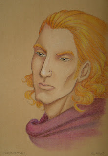
Rigantona's brother, Vercingetorix, in pastel pencils. (Click on the picture for a larger version...)
I think that strictly speaking I make these much too smooth; I use my felt tool thingy all the time, blurring just about every pencil stroke. I guess this is my way of attempting more or less realistic colouring :-). On the other hand, my insistence on graphite pencil lines and sharp contours seems a little contradictory. But I rather like this effect.
Oh - I mixed the purple of the cloak. Go me! More colour experiments are imminent, now that I have got myself a book on colour theory and mixing, yay! ;-)
4 comments:
I'll post comments here then:
Enjoy the vacation, bring back lots of nice stuff, for MEEEEEE!
I much like Riga. More nudes please :-D
Colors are working & you show plenty progress.
I love this blog.
With pencils, the *ideal* solution would be to use only the three primary colours (red, blue and yellow) and no other. I've heard that some people can make an arkwork out of only three pencils colours O_o but of course I can't (eheh). In any case to add depth it can be helpful to use primary colours: in your green parts, for example, add yellow and blue, even with single strokes and not with a continuous shading. I looked for an example but couldn't find one for now, sorry!
I enjoyed my holiday, but at the same time I regret that I haven't been able to draw! I am dying to put those colour tips into practice... Mind you, only three pencil colours - I think I'm a looooooong way away from that XD. I'll already be very happy when I manage to create a decent painting with 12 pans of watercolour, and harmonise the tints of my 36-piece pencil set ;-).
Nout: More nudes? Mwuahaha! I'll post them when they pop up in my sketchbooks, and I have little doubt that they will. I mean, anatomy study and such. But I don't suppose naked blokes are quite as interesting...? :P
All depends on the model -_^ but as you can imagine, the women would grab my attention more.
Keep it coming!
Post a Comment