Sunday, 2 January 2011

Florie

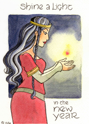
Sometimes I think that watercolours and I can be great friends. Like now. I'm beginning to know what I am doing with these paints, and I am surprised at the amount of control I turned out to have this time round. I think I'm also getting better at distinguishing between the colours things have and the colours they need to have in order to look good. So this painting of Florie has been great fun for me and I'm happy with the result. The lesson to learn (as if I didn't know it already) is that I should just paint as often as possible. All in all, I have painted 11 pictures this week, and I notice the effects. The happy result is that I am getting less scared of doing the comic in watercolour. I'm not looking for "great art" - just something that looks adequate and pretty and less likeliness for me to ruin a page of line art. 

So let's see what I can do in the new year :).

Sunday, 12 December 2010

Inks and paints...

Cecilia is on a campaign to try and make me change my plan of not inking the comic and painting the pencils instead. She is quite insistent on the matter. What to do? An "artist" (I don't like applying this term to myself, but I haven't so far discovered an adequate English translation for "tekenaar", which I do feel I can call myself, despite not being a professional) like me, whose skills are rather limited, has to make the most of the things s/he is good at. So what am I good at? The first thing that springs to mind is "lines" and "inking". It's certainly not colour. Then why on earth would I cut out the inking? Well, for one thing, it takes ages - I ink very, very slowly. For another, I feel like my pencil originals are more lively than my inked versions. I tried to remedy that by using brush pens instead of my faithful Staedtler pens. But with brush pens, you can't draw the tiny details and microscopically smooth lines that I am so anal about. (Yes, I know, why fuss about that when there are still basics that I don't get right? Well, that's me for you.) So inking with brush pens would mean a) adapting my style and b) overcoming my fears. A third reason why I am inclined to dispense with inks is because I feel that stark black lines don't suit my story. I want something softer and more dreamy.


Now - I have recently done a picture for my sister, inked with two Faber-Castell PITT pens, one brush and one Small. It reminded me how much fun these pens are (even if they tend to lose their shape pretty quickly :/). It also reminded me that these exist in a wide variety of colours, so that I wouldn't have to use black. So this week I popped into one of the two art shops in my street and bought a handful of PITT pens in a variety of colours - Caput Mortuum, Warm Grey, Indian Red and Raw Umber. At first, I was a tad nervous about the fact that these colours only exist in brush pens, meaning that I haven't got a Small pen for details or corrections... But then I thought, what the heck, I'll just have to learn and adapt my inking to the brush like a big girl. Above is my first all-brush inked image, done with the Raw Umber pen.

The lady in the picture, as you can tell by the caption, is Florie. She is Gawain's second wife and the daughter of the Carl of Carlisle. The text of Sir Gawain and the Carl of Carlisle doesn't give her a name, so in a previous incarnation of the character I picked a random  Welsh one for her. In the meantime I have changed her name to Florie, which is a name traditionally associated with Gawain. It fits nicely, too, because the sons Gawain has with his second wife are called Florens and Lovell. Okay, Lovell is not so relevant here, but Florens can easily be the son of Florie, right? :-)

Anyway - this image is waiting to be coloured. I hope to get round to it soon.


This little portrait (postcard size) was drawn two weeks ago as an experiment. I wanted to try a combination of colour pencils (for the line art) and watercolour. So this was drawn with a purple pencil and then painted. It didn't work at all. The lines were too pale or not sufficiently defined or something - in any case, the image looked lousy. This may be partly because I used opaque paints - it's possible that the lines would have looked better if I had stuck to transparent ones. I started with a wash of Ceruleum Blue and some orange (made of Winsor Yellow and Permanent Carmine). That mixture produces a lovely, delicate tint (I think), but even though it's pale, it's not transparent. So it was probably not a good idea to use it for washing. In an attempt to save what I could of the image, I accentuated the lines with my Caput Portuum PITT pen, which turned it into something more or less acceptable. 

So what did I learn? Well, first off, I guess I shouldn't be using opaque paint in washes. And secondly, it might be a good idea to draw hair like Lot's in such a way that I can colour it in a more straightforward manner in the comic. I have to simplify it. 

...And a textured version, because the watercolour didn't live up to my hopes ;P.

Monday, 29 November 2010

The Test

Next experiment: simple and almost flat colours. There isn't a grey shade in sight - how often does that happen in my watercolours? I tried to forget most of the colour theories I have been pouring over recently and just paint. I did start off with layers of yellow wash before adding the other colours, so hopefully the image looks more unified than the last one :).

And look: it's not a portrait! It's an illustration! ;P Considering that I started this without any preliminary sketches (I just wanted an image to colour), I think the drawing is not too bad. I tried to stylise and to prioritise readability, doing my best to take Walt Stanchfield's lessons to heart.

PS: it's called "The Test" because it illustrates an episode in which Gawain completes his training and his teacher Conchobarre subjects him to the admission tests of the Fianna. That is why his hair is braided. Of course, to optimise the storytelling in this one, you should also see a few pursuers in the distance :).

CONCRIT = VERY WELCOME.

Sunday, 21 November 2010

Morgana & Lucy: watercolour

I did my best to take this small painting Very Seriously. All the paints were mixed in advance, I thought about the contrast between warm and cold, I created my own blacks, I dried my brush regularly and I used a damp brush to blend different layers.I DID MY BEST. So this is probably as good as it gets at this moment. Mind you, I'm not at all sure whether my efforts actually show. Do they? (Please try the full view.)


I made a version with a Photoshop texture as well. It seems like I am drifting more and more towards traditional art + texture for the look of my Gawain illustrations. I like how this technique allows me to choose a paper with which I am comfortable and then add a textured, old-ish look afterwards.


I can't believe I've painted a cat. I see one around the house every day, and yet cats remain very difficult to draw for me. This particular cat is Lucifer (Lucy for short), Morgana's pet. I shiver at the thought of having to draw him for pages on end, but - well, I simply must have cats in my story. Here's to hoping my skills will improve :).

Princess-of-Shadows' textures

Sunday, 14 November 2010

In which I try my hand at watercolour again...

I think I mentioned before that I would like to do the comic in pencils and watercolour instead of in inks as I originally intended. The reason for this is that I find that my sharp inked style does not suit my story very well. The tale has a dream-like quality that is better served with colour and pencils.There is only one snag: I am one lousy watercolour artist. I don't master the medium, for one thing. And I don't understand about colour, for another. Then again, I am very stubborn and not willing to admit defeat. I'll just keep trying.

The image below is an exercise - it is an idea I had for a possible back cover of The Darkest Hour. I added the text and frame in Illustrator, having discovered that it is so much more convenient for adding text than Photoshop. I haven't tried it yet, but I think I'm going to use Illustrator for lettering my pages too. It's much easier to draw speech bubbles with it than with Photoshop.

I discovered that adding texture in Photoshop can actually cheat people into thinking I had a half-decent watercolour to start with. But I am going to be very honest with you and show you the watercolour as it was before I started toying with it in Photoshop. As you can see, it's ... utterly incompetent. The dress went reasonably well - I like how it looks. But the contrast is not very good and the colours ... well, they don't clash, but they don't exactly spark either. I also did some damage with the masking fluid. I masked Ygraine's plaits and the contours of her figure when I added the dark washes. Not only are the dark washes a complete mess; as the masking fluid came off, it took some of the underlying paint with it and smeared the pencil lines. *sigh* So instead of having white hair with delicate blue-grey shadowing, Ygraine now has dirty grey plaits. I couldn't simply repaint because the paper had suffered as well.
This doesn't exactly bode well for my comic, does it? I have a LOT of work to do before I can tackle my pages with some confidence... I don't understand. It seems like everyone and their sister can paint with watercolour. Why do I find it so hard?

The above are two small, quick sketches of Gorlois. The bottom one was done  some time last year; the top one I did last night. Neither is good, and I completely ruined the top one with my clumsy attempt at shadowing the cloak. But they do illustrate where I am trying to go. Even if I did ruin it, I like the top one in its simplicity. I think - but goodness knows I may be wrong again - that I had better focus on painting as simply as possible, with few layers. And I'm doing my best to study colour.

Opinions and critiques are most welcome. 

NB: I have no idea why the "back cover" image has a green hue when you enlarge it. It seems like Flickr and Photobucket do something to my colours! 
ETA: Fixed! It was a CMYK image. Screens don't like that...

Saturday, 6 November 2010

Pencil sketch: Kundry

Meet Lady Kundry, Gawain's third wife. She first appears in Chrétien de Troyes' Perceval, where she is not given a proper name but gets a few telling epithets instead, such as "l'Orgeuilleuse de Logres" or "la Mauvaise Pucelle". Apart from having the most alluring mouth in Christendom (as per Wolfram von Eschenbach), she also has a marvellously sharp tongue that she uses deftly to lash out at every knight she meets. She makes no exception for her future husband.

I thought she should have a proper name, so I gave her the one she has in Wagner's Parzival, even though the character in the opera is quite different from my version.

Obviously, I like Kundry an awful lot :).

Monday, 1 November 2010

Pencil sketch: Arthur


Here he is: the King Arthur you will eventually meet in my comic. The "classic" Arthur is often blond, but I like mine to look like a lion with a black mane :). (I really need to draw a silhouette in which the lion-like quality of his hairdo is more obvious - I'm rather fond of it...)

Clearly, when I say I want a simpler style and more stylised, I am not talking about my characters' hair. A few simple lines simply will not do in that department ;-). I am so doomed.

Monday, 18 October 2010

Another small pencil sketch

A small pencil drawing a week? Let's see if I can keep it up... It would be nice, and I would have a Moleskine full of nicely finished pictures. - I can dream, can't I? In any case, you can see the style I want to go for. I wouldn't colour the whole comic with pencils (I am enjoying the use of these pencils immensely, but colouring one A3-sized page with them would take a full week), but the pencilled line art is representative of what I want.

This is Lady Ragnell, by the way. She is Gawain's first wife. You are not due to meet her in the story very soon, since our hero has some growing up to do first, but doing character concept sketches tends to help me figure out my stories, so here she is already.

Sunday, 10 October 2010

A small colour pencil sketch

I am swamped with work, so naturally I am experiencing an overpowering urge to DRAW. It is always like that: when I have time, I have no inspiration, and when I don't have time, all I want to do is work on the comic. What can I do? Here and there, I try to squeeze a small drawing in. This sketch is one. I treated myself to a new pocket Moleskine for my birthday and did this as an opener. The colours are brighter in reality, but colour pencils don't scan particularly well :/.


The second version has some Photoshop tweaking and I added a texture ("Psychosomatic", courtesy of Princess_of_Darkness). I find that I like the combination of colour pencils with this particular texture. Maybe I can do something with that in the design of the Gawain website...

I don't know if it is at all obvious, but I am trying out for a slightly different style - a more stylised one. I have tried to draw a little more realistically after having been told that one glance at my drawings suggests that my story is targeted towards children. But this increased realism, combined with my inks, doesn't please me at all. The story I have in mind is more poetic and expressive and dreamy than realistic. Sharp inks and attempts at realism don't suit it. So now I'm looking for a simpler drawing style, pencils instead of inks, and light touches of colour (I'm thinking watercolour, possibly with some colour pencils). This will take some experiment - I need to find out whether I can get the sort of effect that I am looking for, and whether the idea is at all realistic. I will keep you posted :-).